I Prefer Using CSS Grid to Flexbox
June 01, 2020
As a frontend developer, The way we achieve the layout of each section is significantly important. In other words, if you fully understand how to achieve the layout using CSS accurately and quickly, you will not encounter a big hurdle in your work in most cases.
In this article, I will share my knowledge about CSS Grid compared to Flexbox. The CSS Grid information is accessible in many blog posts, Youtube videos, tutorials, etc. I will try to focus on explaining that in a simple way as much as possible.
What is the difference between CSS Grid and Flexbox
CSS Grid is a two-dimensional system and Flexbox is one dimensional. Although Flexbox has the restriction to control the layout only for one dimensional, with CSS Grid you can easily set the position of items no matter how the layout is complicated.

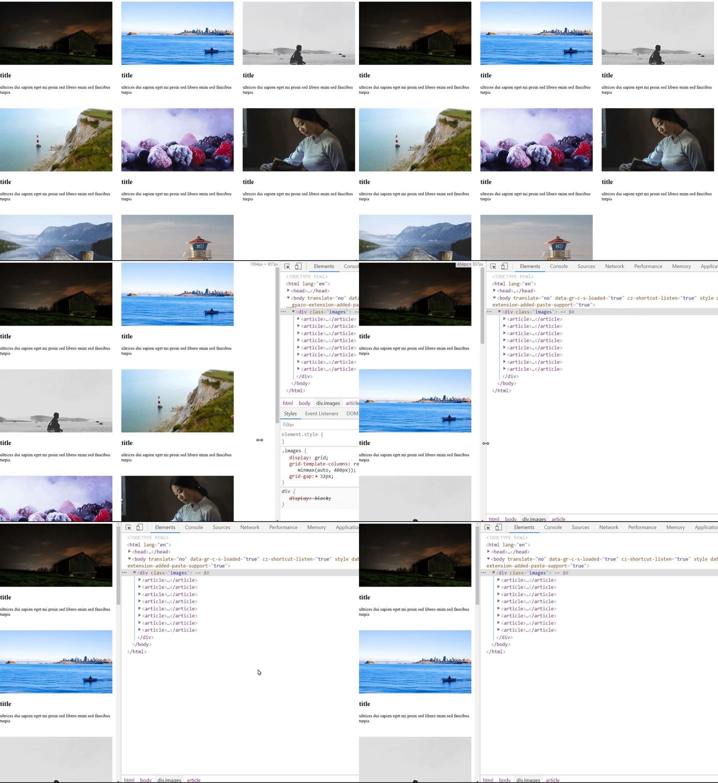
You can achieve this layout with only 3 lines of CSS code using CSS Grid. I will show you the code for the above gif
.images {
  display: grid;
  grid-template-columns: repeat(auto-fill, minmax(auto, 400px));
  grid-gap: 32px;
}<div class="images">
<article>
<img src="https://picsum.photos/400/225?random=1" />
<h1>title</h1>
<p>ultrices dui sapien eget mi proin sed libero enim sed faucibus turpis</p>
</article>
<article>
<img src="https://picsum.photos/400/225?random=2" />
<h1>title</h1>
<p>ultrices dui sapien eget mi proin sed libero enim sed faucibus turpis</p>
</article>
<article>
<img src="https://picsum.photos/400/225?random=3" />
<h1>title</h1>
<p>ultrices dui sapien eget mi proin sed libero enim sed faucibus turpis</p>
</article>
<article>
<img src="https://picsum.photos/400/225?random=4" />
<h1>title</h1>
<p>ultrices dui sapien eget mi proin sed libero enim sed faucibus turpis</p>
</article>
<article>
<img src="https://picsum.photos/400/225?random=5" />
<h1>title</h1>
<p>ultrices dui sapien eget mi proin sed libero enim sed faucibus turpis</p>
</article>
<article>
<img src="https://picsum.photos/400/225?random=6" />
<h1>title</h1>
<p>ultrices dui sapien eget mi proin sed libero enim sed faucibus turpis</p>
</article>
<article>
<img src="https://picsum.photos/400/225?random=7" />
<h1>title</h1>
<p>ultrices dui sapien eget mi proin sed libero enim sed faucibus turpis</p>
</article>
<article>
<img src="https://picsum.photos/400/225?random=8" />
<h1>title</h1>
<p>ultrices dui sapien eget mi proin sed libero enim sed faucibus turpis</p>
</article>
</div>It's possible to make the exact same layout using Flexbox as below.
.images {
  display: flex;
  flex-wrap: wrap;
}

article {
  max-width: 400px;
  margin-right: 32px;
  margin-bottom: 32px;
}
With Flexbox, CSS will be a little bit more complicated. Both flex container and flex items need to include some CSS properties. To make code more maintainable, I personally prefer to substitute margin with CSS Grid properties for the layout as much as possible.
grid-gap is a great weapon for a responsive design
grid-gap is a useful property for responsive design. Nowadays most websites apply responsive design. Therefore a frontend developer should always consider the layout for multiple devices.
Responsive design sounds intimidating to the beginners but grid-gap can make your frontend development so much easier and you will never be afraid of responsive design.
grid-gap can be written as below.
.images {
  /* To set the same amount of gap to both dimensions */
  grid-gap: 32px;

  /* To set a different amount of gap to the vertical and horizontal dimension  */
  grid-gap: 16px 32px;
}
As I said in the previous topic, I personally don't prefer using margin for adjusting the layout. In the case of using Flexbox in the mobile view, in most cases, you need to add margin to the last flex item something like that.
article:last-child {
  margin-bottom: 0;
}
This is a kind of ugly code for me. Only setting margin to the last item is irregular and sometimes It may cause the confusion of development. With grid-gap code will be more readable and can prevent any confusion.
Frequently used CSS Grid patterns
Here, I show you the CSS Grid patterns that I have used often for the project.
The first one is the code for the gif that I have already shown in the first paragraph.
.images {
  display: grid;
  grid-template-columns: repeat(auto-fill, minmax(auto, 400px));
  grid-gap: 32px;
}
You can also achieve it switching auto-fill to 8 because this grid container contains 8 grid items. minmax(auto, 400px) is literally for setting min and max values for the width of the item so the width of these items won't be wider than 400px in this case.
Another CSS Grid pattern I have frequently used is the code below.
.images {
  display: grid;
  grid-template-columns: auto auto;
  grid-gap: 16px;
  align-items: center;
  justify-content: space-between;
}
In this code, When the grid container only contains 2 grid items grid-template-columns will set the width of each item to either auto auto, or 1fr 1fr, or even a specific pixel such as 400px 400px. align-items and justify-content are available for both Flexbox and CSS Grid. These are not tricky properties. align-items manage the vertical position and justify-content adjusts the space between each item horizontally in this case.
Getting a grasp of the fundamental idea of CSS is not difficult. The easiest path to achieve that is playing around CSS Grid then eventually you will be comfortable working with CSS Grid.
In which case Flexbox should be used ?
No doubt that CSS Grid has more features than Flexbox but It doesn't mean you should always prioritize CSS Grid. When the items don't require the tweak of a gap and also the container is 1 dimensional I prefer to use Flexbox.
Also using both CSS Grid and Flexbox can't cause anything harmful to the project. With a mix of CSS Grid and Flexbox, Let's make the project more concise and great.
Conclution
I hope you guys have enjoyed my article. There is not the perfect way of writing CSS as same as any other programming language. However, I'm pretty sure that CSS Grid must be the smart choice to achieve each section under a grid container.
If you have any questions about CSS Grid or have an own way of writing CSS code different from the one I explained in this article, I would love to hear your brilliant idea.
As usual thanks for reading my article. Keep coding, devs!
Reference
https://picsum.photos/
Used for getting random pics
https://loremipsum.io/
Used for getting random sentences
